Originally published on 11/2/2007, Associated Content by Pam Gaulin
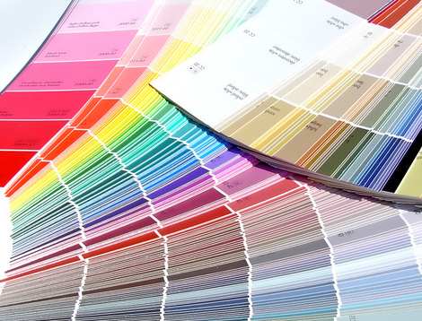
News about 2008 home decor color trends has been out for a while, and now popular home interior paint makers like Benjamin Moore have released their hot 2008 paint colors. Benjamin Moore has 21 different paint hues in their 2008 palette, according to the press release. Benjamin Moore is also forecasting the three home decor hues that will be the most popular in 2008.
Three Most Popular Benjamin Moore Paint Colors for 2008
Benjamin Moore is forecasting that three colors in particular, from their 2008 color palette will be the most popular not only in paint color, but in other home decor accessories.
These three colors are :
Gypsy Pink - a bright, jewel-like fuchsia pink
Peacock Feathers - a dusty, retro, Art Deco blue
Split Pea - a milder and less fluorescent version of a popular late '80s hue
To see these three colors together, and in a home bathroom context, see Image 2.
21 New Colors in Three Paint Color Categories
According to Benjamin Moore, each of those 21 paint colors for 2008 home decor falls into one of these three color categories:
"Organic Comforts"
"Pure Opulence"
"Modern Tranquility"
According to Benjamin Moore, all of the colors in their 2008 palette are compatible with each other, allowing for great diversity and personalization in 2008 home decor interior decorating and re-decorating. Which 2008 colors you choose, and how you mix and match them is a completely personal choice. Some colors may work better with existing furnishings, for example.
Each of these color moods has its own 2008 home decor colors. Let's explore each one separately.
"Organic Comforts" by Benjamin Moore
"Organic Comforts" are a 2008 color group for home decor that continues the 2007 trend of blurring the walls between home interiors and the great outdoors. Create garden-like atmospheres, natural living spaces, and bring the hues from outside your windows to the inside with these 2008 interior decor choices.
The Benjamin Moore interior paints that fit into this color category are:
Cape Hatteras Sand - A lovely sand color that is neutral, yet new
Everlasting - A warm neutral that will last beyond 2008
Mayflower Red - A warmed up cinnamon with a bit of clove
Misted Fern - A modern take on a neutral grayish-green
Providence Olive - A brownish neutral with a tad of green
Sulfur Yellow - A tannish yellow, that is not too bright
"Pure Opulence" by Benjamin Moore
The jewel-like tones in the "Pure Opulence" home decor palette continues the home decor trend of seeking inspiration from exotic far off places, and images from Bollywood. Except in this 2008 color palette for home interiors, the tones have been taken down about three notches and are not as bold.
Home interiors that need a little livening up in 2008 will do well with one or two of these color choices:
Aegean Teal - A powdery sea-like blue
Cherokee Brick - A pinkish brick color, if it the brick was shiny and new
Ferret Brown - A very warm, coffee brown
French Violet - A warm bluish violet, subdued enough for both men and women
Rockport Gray - The color of a misty morning by the seashore
"Modern Tranquility" by Benjamin Moore
The "Modern Tranquility" 2008 color family takes the essence of organic comforts one step further, into an almost dream-like state of hues. This color palette also offers a wide array of peaceful and extremely livable neutrals to complement other 2008 home interior colors.
Capri Coast - A bright beige neutral
Green Tint - A barely-there neutral that is more gray than green
Latte - A neutral with a touch of pink
Litchfield Gray - A neutral with a dab of brown
Sidewalk Gray - A sun-faded gray
Wedding Veil - the palest of neutrals without being white
Pick one or two of your favorite new 2008 paint colors for your home decor and then add the neutrals.
Source:
Benjamin Moore, http://www.benjaminmoore.com

Close